Roadsign System for the City of Utrecht

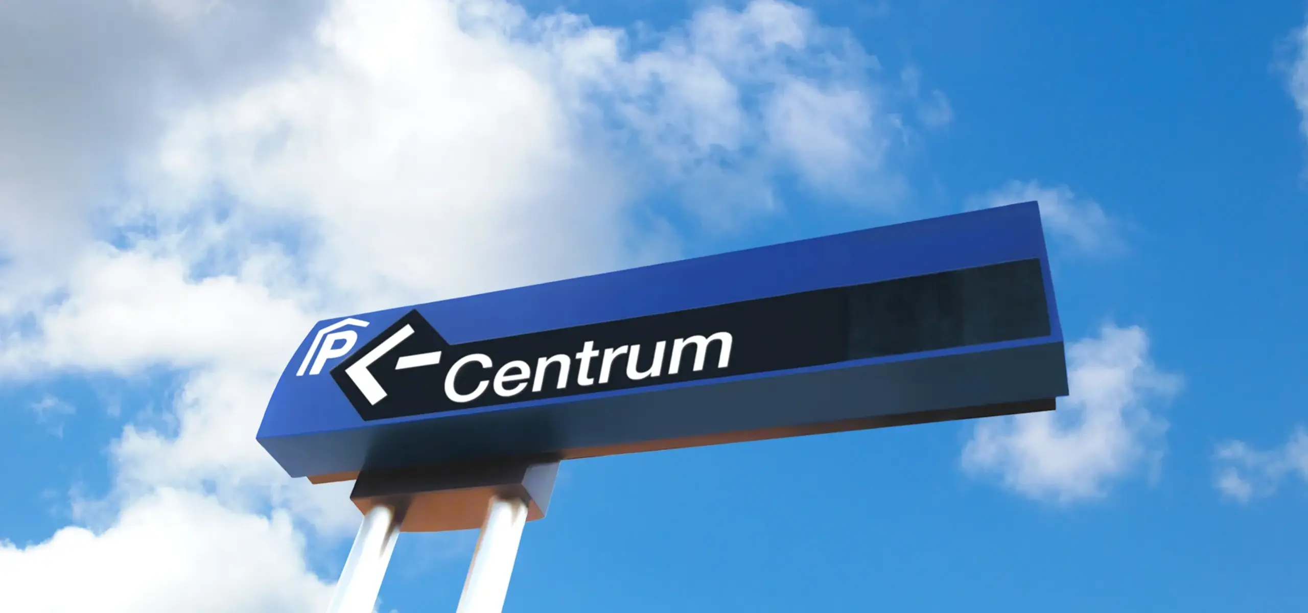
In designing a roadsign system for the City of Utrecht, very different and often contradictory requirements had to be reconciled. It goes without saying that the signs should be recognizable, but at the same time they should not visually dominate or clutter the public space. Under all circumstances they should be legible at a glance, be vandal-resistant and able to endure different often extreme weather conditions. Furthermore, a design style should be chosen that can stand the test of time, as communities must live for many years with these objects in view.
In order to give the signs a distinguishing and recognizable character, two slender fastening poles were chosen instead of one thick one. This gives the signposts a visual lightness and provides a subtle deviation from the existing general Dutch signposting, whereby the special local function of these signs is clear at a glance.
The system, comprising both static and electronic versions, has been in use for many years in and around the City of Utrecht.
Joanna and Hanno have worked on many successful design projects for the public space including the Dutch national letterbox, playground equipment and public seating.
Other projects
Have a look at other projects by Groen & Boothman
Inspired by our work?
Please fill out the form, so we can learn more about you and your needs.


