Design evolution of an icon: The Dutch twin letterbox
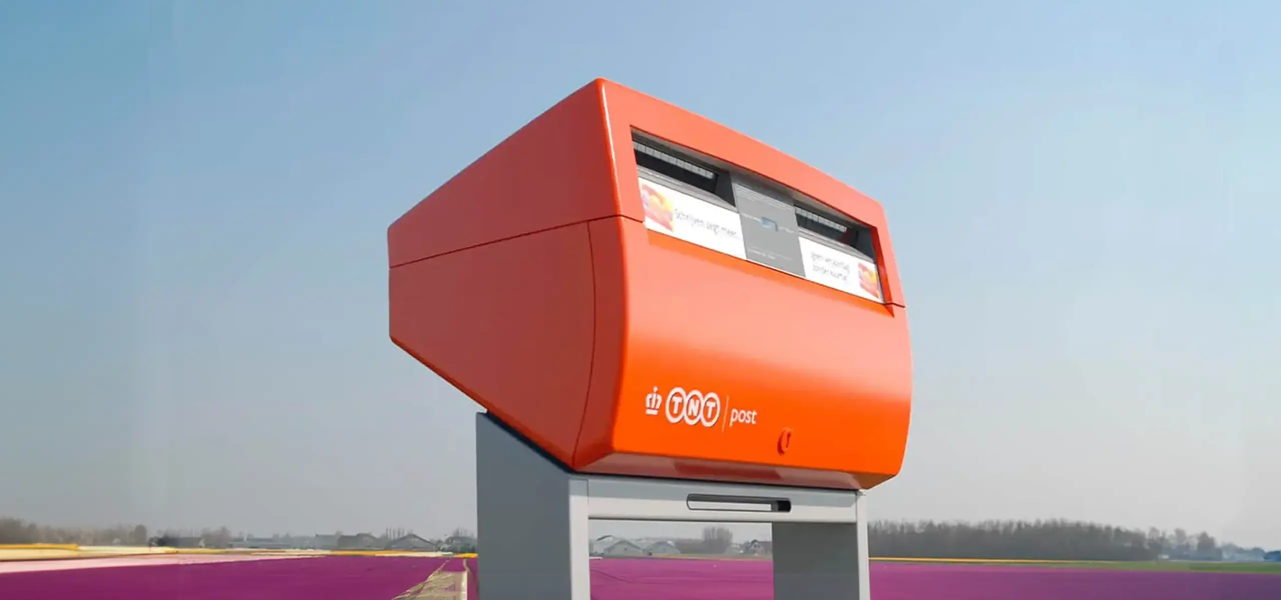
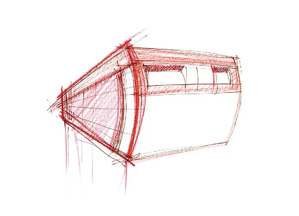
Designing the new Dutch twin letterbox
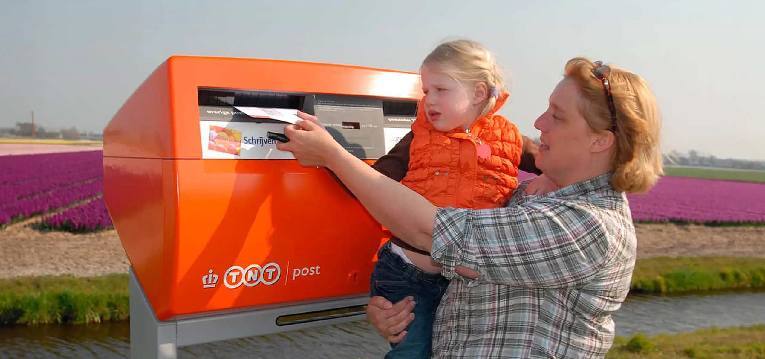
This second generation design was introduced in 2001 and gradually came to replace its predecessor, which had been on the streets since the 1960’s. The first generation was also very innovative for its time. This now current design comprises a number of functional improvements, including a larger capacity, better security and a dynamic display. Furthermore it has an integrated space for postal marketing communications.
Fitting the Dutch Landscape
The national letterbox has an iconic status in the Dutch landscape and infrastructure. Therefore the goal was to create a design that could stand the test of time, minimally 30 years, both functionally and aesthetically. It should be recognizable from a distance and instill a sense of pride and trust in the people. This innovative design is in fact a revolution in the design of letterboxes, balancing function and form in an elegant and characteristic way. As a result it stands out from typical designs for letterboxes worldwide.
Expertise involved in the iconic Dutch twin letterbox design
Extensive research to fully understand all of the postal logistics and infrastructure in the Netherlands
Design thinking; understanding and translating the spectrum of needs and wishes of the postal service and its clients into viable design directions
Product design and detailing
Testing; ergonomics and product safety for safe and durable use in the public area
Besides the Letterbox, Joanna and Hanno have worked on many successful design projects for the public space including street furniture for the city of Rotterdam, playground equipment and traffic signing for the city of Utrecht.
Other projects
Have a look at other projects by Groen & Boothman
Inspired by our work?
Please fill out the form, so we can learn more about you and your needs.

